A photographer's website should feel like a cinema, not a blog. The image should fill the screen, the interface should step back, and the words should support the pictures instead of competing with them. Most blog themes do the opposite: small images in a grid, busy sidebars and white backgrounds that wash out the shadows in your photographs.
Ghost is a strong platform for visual storytellers who also write: photo essays, film writing, visual journalism, a newsletter about your work. This guide covers what such a site needs from a Ghost theme, and how our dark-first theme, Noir, handles it.
What a visual storytelling site needs
Full-screen images
Your strongest image should be the first thing a visitor sees, edge to edge. Posts should open the same way: photo first, title over it.
A dark background
Dark backgrounds make photographs look richer and keep the eye on the image. But it should be a choice: some readers prefer light, and some stories do too.
Layouts for photo essays
A photo essay is not an article with pictures. It needs layouts where the image stays present while the text moves, and where sequences of photos can run full width.
Restraint
No clutter, no widgets, no sidebars. Navigation that is there when you need it and disappears when you do not.
A newsletter and memberships
Photographers increasingly fund personal projects through members: early access to series, behind-the-scenes notes, print offers for members. The membership pages should be as quiet as the rest of the site.
How Noir handles it
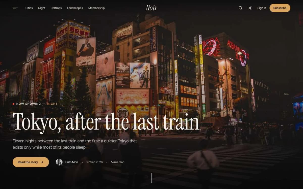
Noir is a cinematic, dark-first Ghost theme for photo-journals, film writing and long-form visual stories.
Homepage as a film. A full-screen hero story with a slow cinematic push-in (choose the latest post or your newest featured post). The next three stories appear as large alternating frames with big italic numbers, 01 to 03. "The Reel" is a sideways-scrolling strip of up to eight featured stories. An interlude section holds one large italic line and a subscribe form. More stories follow with Load more.
A frosted header floats over your photographs.
Posts that open with the photo. By default a post opens with its feature image filling the screen and the title over the bottom of the photo, with the caption in the corner. Posts without a feature image get a simple text header.
The Split template. For photo essays and interviews, the feature image stays fixed on the left half of the screen while the story scrolls on the right. On phones, the photo sits above the text.
Full-width images and galleries. Use Ghost's wide and full-width image options and galleries generously; captions are set small with an amber dash, and any photo opens full screen in a lightbox.
Optional film grain. A subtle animated grain texture over the whole site, very light, never blocking clicks, and still for readers who prefer reduced motion. Turn it off for a cleaner look.
Next story band. A full-width "Next story" band with its photograph at the end of each post.
Collections and Writers. A Collections page shows every tag as a large photo tile. A Writers page shows authors as a portrait grid, black and white until hovered.
Memberships. A membership page with tiers and a monthly/yearly switch, a styled paywall, and sign-in, sign-up and account pages.
Details. Dark first with light and system modes and a reader toggle; a side menu with collections and theme switch; reading progress; self-hosted Instrument Serif and Inter Tight fonts; full translation support; 16 theme settings; no jQuery.
Look at it on a large screen: the Noir live demo.
What Noir does not do
- No client galleries or proofing. Noir publishes stories; it does not deliver private galleries to clients for selection.
- No print shop. Link to your print store, or offer prints to members.
- Needs strong images. Every post should have a feature image at least 2000 pixels wide. A site of mostly text posts will feel empty.
Which visual theme is right for you?
We built several image-led Ghost themes because "visual" covers different needs:
- Noir: cinematic photo essays and film writing, dark first.
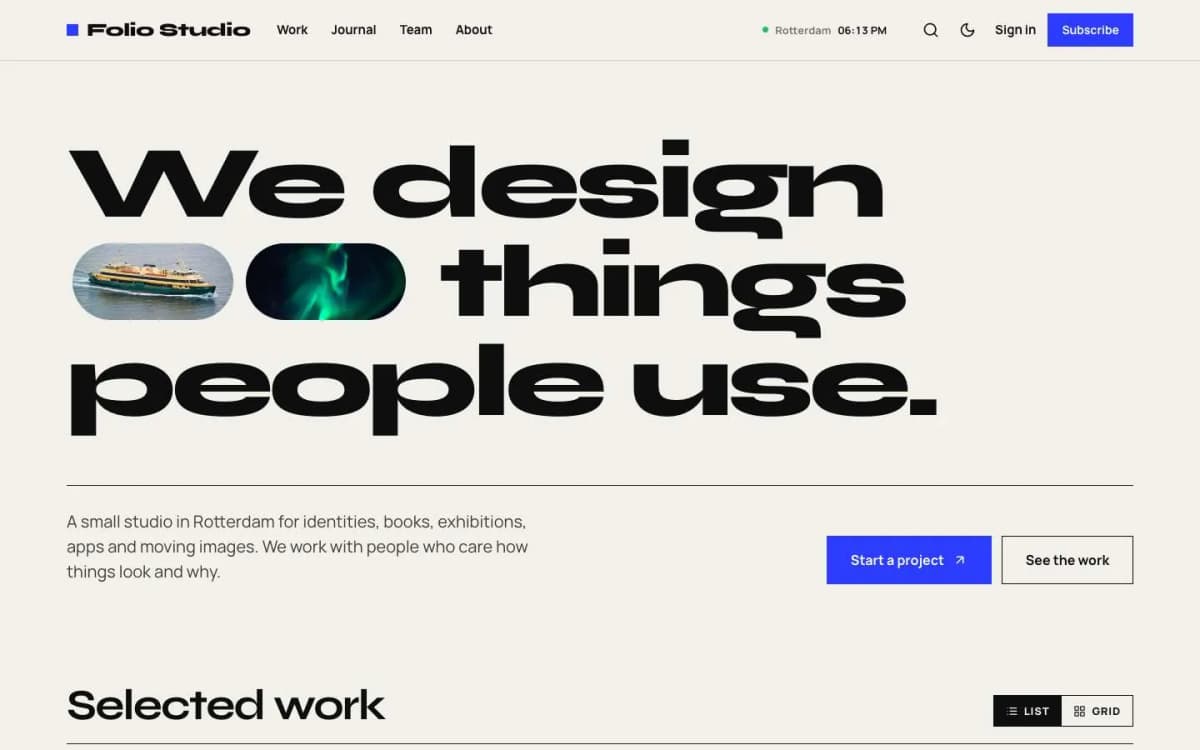
- Folio: a design studio or freelance portfolio with case studies. See the best Ghost theme for a portfolio.
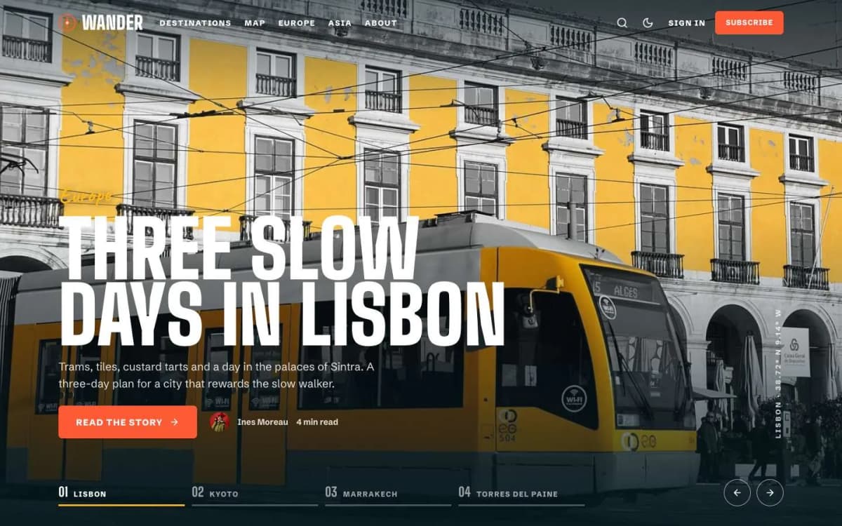
- Wander: travel stories with a map. See the best Ghost theme for a travel blog.
- Atelier: fashion and style magazines with lookbooks.
Tips for publishing photo stories on Ghost
- Export at about 2000–2500 pixels on the long edge. Ghost makes smaller versions for phones automatically.
- Write real captions. They add context and help search engines understand images. Fill in alt text for every photo.
- Use the Split template for interviews and essays where one portrait or scene anchors the text.
- Group work into collections (tags). Give each a strong cover image; they become the Collections tiles.
- Feature your best eight stories for The Reel.
- Send each new series as a newsletter. Three images and a paragraph, linking to the full story.
- Offer members something specific. Early access to a new series, a monthly behind-the-scenes note or a member print offer. See our Ghost memberships guide.
Preparing images for the web
Photographers care about image quality, and big files are the biggest threat to a fast site. A routine that keeps quality high and pages fast:
- Export at a sensible size. For full-screen images, around 2,000 to 2,400 pixels on the long side is plenty for most screens. Ghost creates smaller versions automatically for phones and thumbnails.
- Use good compression. Export JPEGs at high but not maximum quality. The difference between 85% and 100% is rarely visible and the file size difference is large.
- Use the sRGB colour profile so colours look the same in every browser.
- Remove location data from photos when you do not want to publish where they were taken.
- Name files descriptively before upload, for your own sanity in the media library.
Protecting your work
Any image shown on the web can be copied. You cannot stop that completely, but you can make your ownership clear:
- add a copyright line to your footer and your about page;
- keep your camera metadata (author and copyright fields) in exported files;
- publish at web sizes rather than full resolution;
- use reverse image search now and then to find copies;
- consider a subtle watermark only for images you know are often copied, because heavy watermarks spoil the viewing experience for everyone else.
Selling and earning from photography on Ghost
Ghost's memberships give photographers a few honest ways to earn:
- Paid photo essays and behind-the-scenes posts for members who want more than the public portfolio.
- Downloadable files, such as wallpapers or presets, attached to members-only posts with Ghost's file card.
- Workshops and tutorials, published as members-only posts or a series.
- Print sales, linked from posts to a print shop service, since Ghost itself does not handle physical orders.
Writing alongside images
Short captions with place, date and context help readers and search engines understand each photograph without slowing the story down.
Bottom line
A visual storytelling site needs full-screen images, a dark stage, photo-essay layouts and an interface that steps back. Noir provides all of that, plus memberships, in a fast theme for $59.
See your work on a dark stage: open the Noir demo and get Noir. Want it set up for you, collections and all? Our Ghost theme install and setup service does it.
Frequently asked questions
Ghost is good for photographers who tell stories: photo essays, film writing, visual journalism and journals with a newsletter. If you need client galleries, proofing and print sales, use a dedicated photography platform alongside it.
Every post should have a feature image at least 2000 pixels wide. Ghost creates smaller versions automatically and serves them to phones.
Yes. Noir is dark first, but you can set the colour scheme to light or system, and readers can switch with the sun and moon button.
A post layout for photo essays and interviews: the feature image stays fixed on the left half of the screen while the story scrolls on the right. On phones, the photo sits above the text.