Culture magazines are judged on taste before a single review is read. A music or arts publication that looks like every other blog template signals that nobody cared about the design, which is a strange message from people who write about design, sound and style for a living.
Ghost is a strong platform for independent culture magazines: quick to publish, with newsletters and memberships for readers who want more. This guide covers what a culture magazine needs from a Ghost theme, and how our theme, Volta, makes every topic look different.
What a culture magazine needs
A front page that looks designed
Big cover story, clear sections, a sense of energy. The homepage should look like an editor laid it out, even when it updates automatically.
Sections readers recognise instantly
Music, film, style, art, food. Each should feel distinct, ideally at a glance, without reading a label.
Headlines with presence
Culture magazines use big, confident type. Condensed headlines, sometimes in capitals, give the magazine-cover feel.
A layout for big visual stories
Some features deserve a full-screen image with the headline on top.
Something that says "now"
A ticker of the latest headlines, a trending list. Culture moves fast.
How Volta handles it
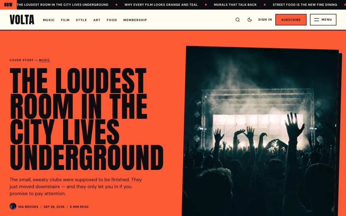
Volta is a loud, colour-blocked Ghost theme for culture magazines, where every topic owns a colour.
Colour by topic. Set a colour on a tag in Ghost Admin. Every post whose main tag is that tag uses the colour for its header band, card highlights, chip, reading progress bar and "Up next" band. The tag page, the topic tile and the homepage band use it too. Tags without a colour use your site's accent colour.
A colour-blocked homepage, built automatically. From top to bottom: a ticker of your latest eight headlines, the cover story on its topic colour, an "Up next" strip of the next three posts, topic bands for your four biggest topics (each a full-width colour band with its three latest posts), a trending list of up to five featured posts with big outline numbers, and a big subscribe block.
Giant condensed headlines, with an option to set them in capitals like a magazine cover.
Two post layouts. The default puts the headline on a band in the post's topic colour with the feature image overlapping it; the Poster template fills the screen with the image and sets the headline on top.
Every post ends well. Tags, share buttons, an author box, an "Up next" band and related posts, each of which can be turned off. The first paragraph gets a drop cap in the topic colour.
More. A full-screen menu with topics and theme switch; Topics and Writers pages; membership page with tiers and a monthly/yearly switch; styled paywall; sign-in, sign-up and account pages; light, dark and system modes; reading progress and lightbox; Load more without page reloads; every Ghost editor card styled; self-hosted fonts with no external requests; full translation support; 16 theme settings; no jQuery.
See the colours on the Volta live demo.
What Volta does not do
- Not quiet. If you want calm and minimal, choose Marlowe or another calmer theme.
- Needs regular content. The bands and trending list look best when several topics publish every week.
- Not a photo portfolio. For image-first stories, see Noir.
Choosing your topic colours
- Pick light, bright colours. Volta sets text on coloured areas in near-black, so pale or bright colours keep it readable.
- Keep them distinct. Neighbouring hues (two oranges) defeat the purpose.
- Limit topics to six or so. Each colour should mean something.
- Start from the demo's palette if unsure: music
#FF5A36, film#FFD23F, style#FF8FC7, art#3DDC97.
Running a culture magazine on Ghost
- Publish across topics weekly so every band stays fresh.
- Feature five stories for the trending list; rotate them.
- Use Poster for your biggest features each week.
- Send a weekly newsletter with the best of each topic.
- Offer members something specific: extended interviews, playlists, event presales or an ad-free archive. See Ghost memberships with Stripe.
Other themes to consider
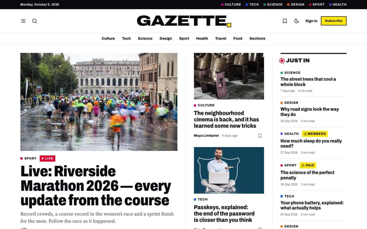
- Gazette: general news with sections and a live blog. See the best Ghost theme for a news site.
- Atelier: fashion and style with lookbooks.
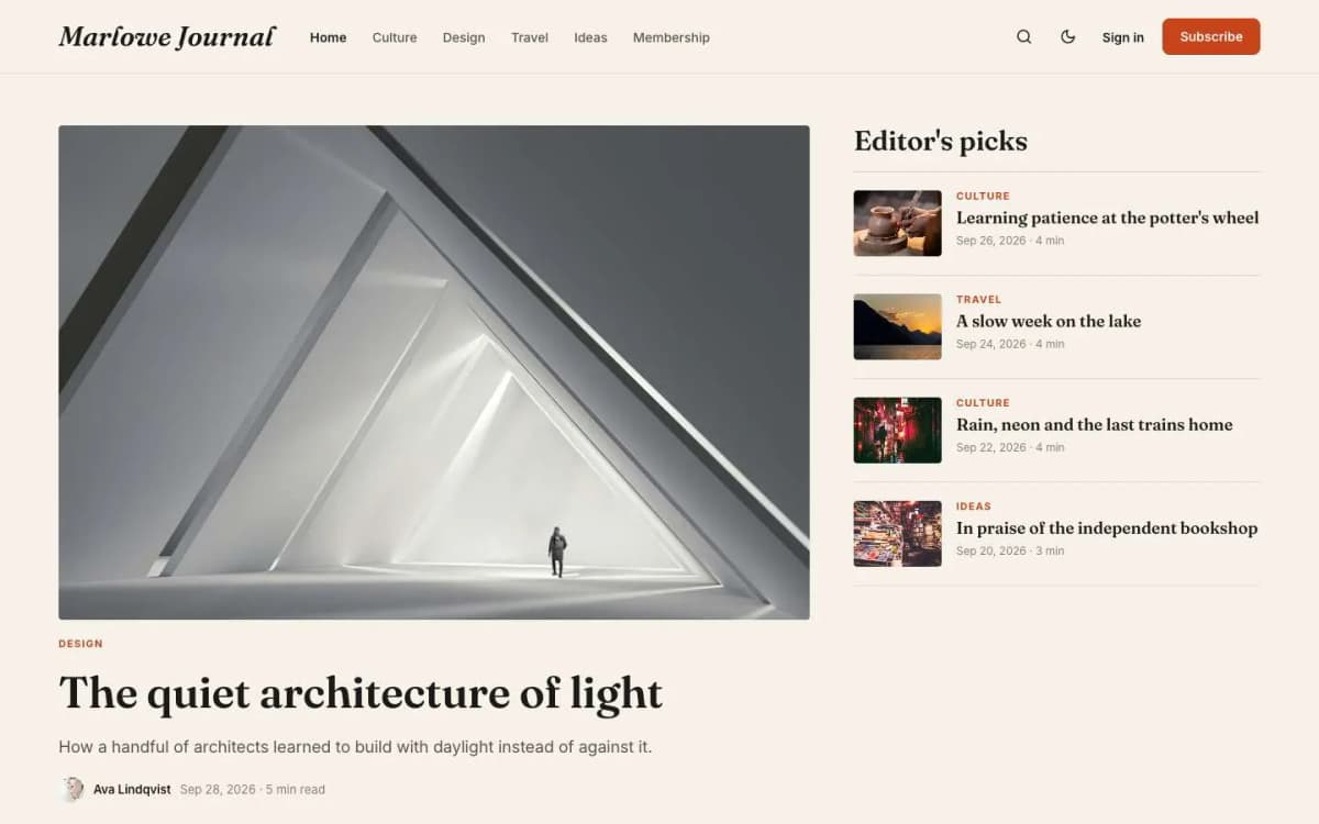
- Marlowe: warm, editorial and bookish.
- Compare all of them on our Ghost themes page.
Planning a colour system that lasts
Colour is Volta's biggest strength and the easiest thing to get wrong. A few principles:
- One colour, one meaning. Each colour should belong to one topic and stay with it. Readers learn that yellow means film; changing it confuses them.
- Start with your biggest topics. The four biggest tags get homepage bands. Give them your strongest, most distinct colours.
- Test text contrast. Volta sets near-black text on coloured areas. Very dark or very saturated colours make that hard to read; pale and bright colours work best.
- Keep the accent separate. Your site accent colour is used for tags without a colour and for buttons. Choose one that does not clash with any topic.
- Write the palette down. Keep a short list of topics and their codes, so new editors do not add near-duplicates.
Headlines that work in giant type
Volta sets headlines very large and condensed, optionally in capitals. That rewards short, punchy headlines and punishes long ones. Aim for headlines that make sense in six to ten words, and use the excerpt for the detail. Test your longest typical headline on a phone before committing to capitals.
Feeding a front page that builds itself
Because the homepage is built automatically from your newest posts, featured posts and biggest tags, it looks best with a steady rhythm:
- publish across your four main topics each week, so no band goes stale;
- feature five pieces at a time for the trending list and rotate them weekly;
- use the Poster template for one big visual story each week, so the cover changes character;
- keep the ticker on; it shows readers the site is alive even between big stories.
If your schedule is lighter than that, turn off sections you cannot feed, such as topic bands, rather than letting them show old stories.
Reviews, interviews and listings
Culture magazines mix formats: album and film reviews, interviews, event listings, essays and photo stories. Volta handles all of them with Ghost's standard cards: pull quotes for interviews, galleries for photo stories, toggles for listings, tables for line-ups and track lists. Use a consistent opening for reviews, such as a one-line verdict in the excerpt, so readers know what they are getting before they click.
Contributors and pitches
Culture magazines live on fresh voices. Publish a short page explaining what you commission, how to pitch and what you pay, if you pay. Give each regular contributor a staff account with a photo and bio, so their work collects on their author page. Credit photographers and illustrators in every post. A clear, fair process attracts better pitches and builds the network that keeps a culture title interesting.
Events and listings
If you publish listings, keep them in posts tagged by month or city, and remove or mark past events so readers do not plan around something that has already happened.
Bottom line
A culture magazine should look designed and feel alive. Volta gives every topic its own colour across the whole site, builds a colour-blocked front page automatically and sets headlines like a magazine cover, for $59.
See it in colour: open the Volta demo and get Volta. Want it set up with your topics and colours? Our Ghost theme install and setup service does it.
Frequently asked questions
Set a colour on a tag in Ghost Admin. Every post whose main tag is that tag uses the colour for its header band, card highlights, chip, reading progress bar and Up next band, and the tag page and homepage band use it too.
Light, bright colours, because Volta sets text on coloured areas in near-black. The demo uses colours such as #FF5A36 for music, #FFD23F for film and #3DDC97 for art.
Yes, ideally. The colour bands and topic sections look best with regular publishing across several topics. If you publish once a month, a calmer theme will suit you better.
A post layout for big photo stories: the feature image fills the screen and the headline sits on top.